|
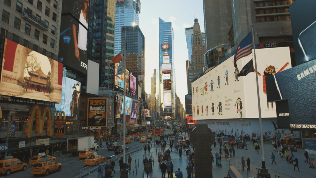
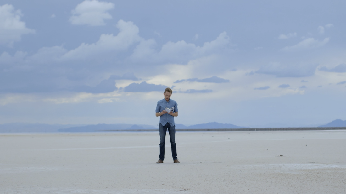
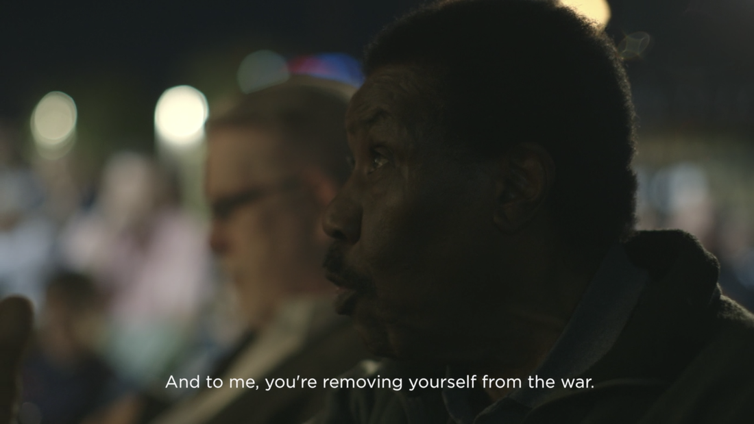
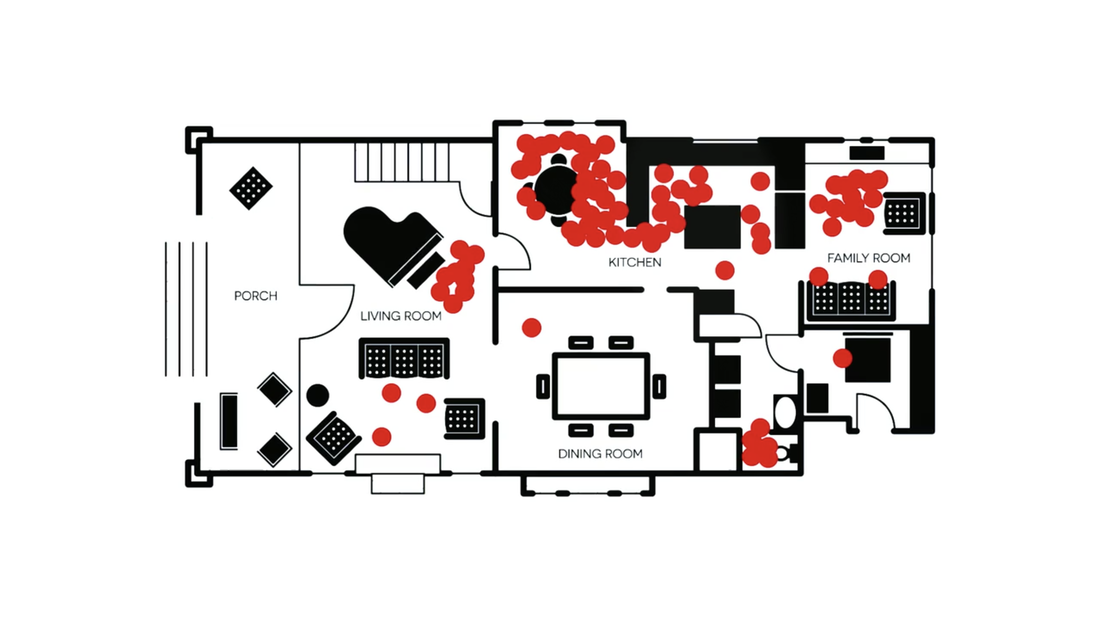
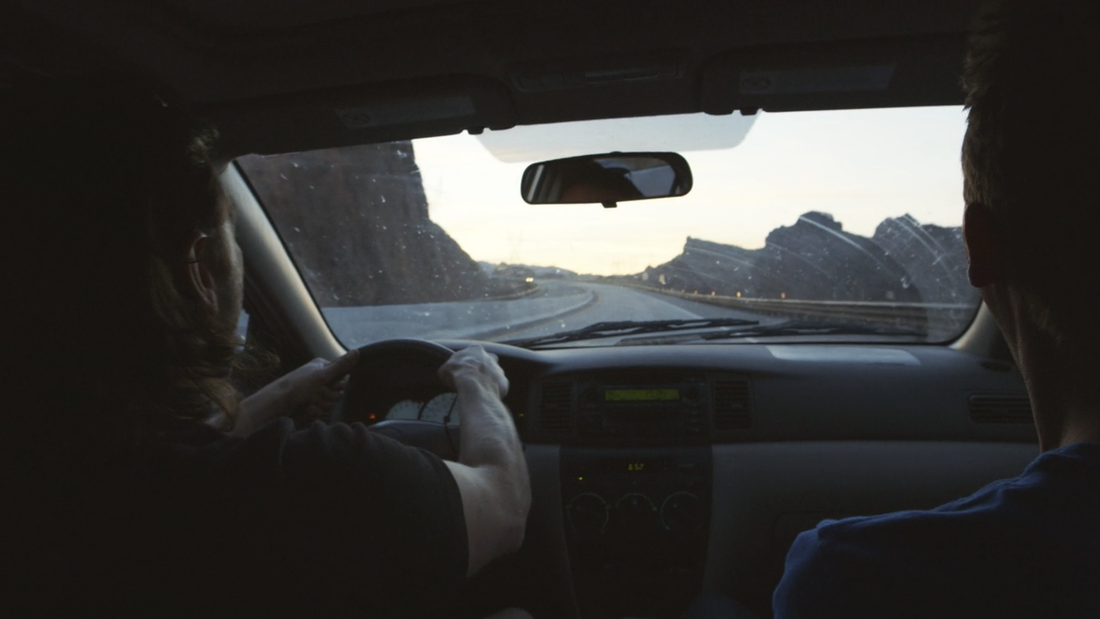
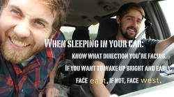
Minimalism: A Documentary About the Important Things is definitely a movie with a message. The story is told mostly by following two men, Ryan and Josh, as they promote their book, Everything That Remains. We also hear from some talking heads people who practice minimalism to some extent in their daily lives. This message is basically the story. But like all film the cinematography is telling its own story. Here are my five favorite shots that help tell the story. Check out our review of the movie in podcast form here! Shot #1: Times SquareWhat better place to start a movie about minimalism than the heart of capitalism? This shot is the opening look of the film and is held for a solid five seconds. Screens abound. Advertisements everywhere. Taxis, people rushing by. It's an iconic view and simply by dint of the title of the film we're looking at it in a different way. Not sure if it's stock footage, but if it is, it's simply great usage. A solid start. Shot #2: Expectations = Humor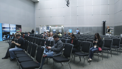 We've been told that Josh and Ryan are heading to SXSW to speak. We have before this a great shot of Ryan delivering the message of minimalism and then the reveal: mostly empty seats and people on phones. Really good use of setting expectations to get an easy laugh. Shot #3: Visualizing the MessageHere is maybe my favorite look of the whole film. Clearly the director Matt D'avella wanted to get some quotes from the book Everything That Remains into the film. And instead of just having Josh read them in an ordinary space, they trek out to an area devoid of anything. Visual minimalism paired with personal minimalism. A great shot that taking what could've been boring and making it stand out. Shot #4: Focus on Shallow Depth of FieldThe movie doesn't have a lot of dissenting opinions, though it does offer a few comments from Clyde Dinkins, an attendee at a Las Vegas talk. The videographers got some great images of Clyde, highlighting his comments which are some of the most thought-provoking in the film. Shot #5: Graphics, the Good and the BadNot all graphics are created equal. I'll include two here. The first is a simple but effective visual of a standard house set-up with the red dots indicating areas people use. Really driving home a message. The second is a intertitle card (see below) used about three times throughout the movie. If you're going to use intertitles to convey messages, jazz it up a little. Use them with a purpose. Have it mean something. This felt like information that could've been conveyed through interviews. Bonus! Iconic Road Trip Shot!An oldie but a goodie and one Highway Walkers have used too many times to count. Two friends on a drive, looking over the shoulder at the open road... Sometimes you just can't beat a classic.
Again check out our podcast review of the film here! Thanks for reading.
1 Comment
6/2/2021 03:17:02 am
One of the most fabulous posts I’ve seen, your travel 5 best shots covers all our needs, thanks!
Reply
Leave a Reply. |
Watch Our Films FREE!Suggested Reading
-3 Lessons from ultrarunner -Role Model: Search Local -How to Sleep in Your Car -How to Hitchhike: Advice -How to Adjust a Backpack -How to Hitchhike Safely -Dustin: Hitchhiker *video - Zach at Niagara Falls *video -NYC Interview *video -Trouble Crossing * video -Iron John Journey *video -Letter From a Viewer -Ibn Battuta: Exploreer -Danny Schmidt/Carrie Elkin -Top 5 Famous Hitchhikers -Hitchhiking:Trip at a Glance -Filmmaking; Perseverance! -3 Things Lionel Said -Radio Interview: WEHC -Adventure: Idea to Action -Miller's Gourmet Popcorn * -Poem from a fan AuthorsDarrell and Josiah |





 RSS Feed